 |
 |

Cover Analysis-For my masthead I decided to make it quite ‘scratchy’ and ‘graffiti like’, to show the magazine is quite rebellious and edgy. I also added in a purple colour for the ‘X’ to make it slightly different from conventional mastheads. My main image is of the band ‘Here I Stand’ and as Kyran is the main focus he is in the middle and is slightly
further forward and larger than the others. The other images I used were for ‘free posters’. I have quite a few cover lines on my front cover, and ‘exclusive’ on the top, a ‘win’ on the bottom and a ‘+’ that has a lot of extras on the left. I decided to price my magazine at £2.00, I believe it is quite reasonable for my target audience's price range. The date is Dec 2010 and it is a monthly magazine. The colour scheme I have used is black, white, green and purple. I decided to use purple because Chris’ top in the image is purple, which made me come to the conclusion of using its opposite colour green to add effect to the cover. The other reason I chose purple was I wanted to appeal to females whilst avoiding a stereotypical pink, purple is feminine and cool. I have used a few shapes on the cover, such as the slanted rectangle around the words ‘Here I Stand’ and ‘Kyran Murphy’, also rectangle shapes for ‘exclusive’ and ‘win’. I also put a border around the posters to make them stand out a bit more. The fonts on my layout are slightly varied but not a lot, they are all bold and are sans-serif. Kyran and Toms heads overlap the title which shows its quite a well known magazine, also the text overlaps the boy's torsos to make it stand out. I think the language I have used relates well to my audience, the title ‘Kyran Murphy Screams Out’ shows will be talking to us and the readers, but he is also the ‘screamo vocalist’ of the band which makes the title easy to relate to.

further forward and larger than the others. The other images I used were for ‘free posters’. I have quite a few cover lines on my front cover, and ‘exclusive’ on the top, a ‘win’ on the bottom and a ‘+’ that has a lot of extras on the left. I decided to price my magazine at £2.00, I believe it is quite reasonable for my target audience's price range. The date is Dec 2010 and it is a monthly magazine. The colour scheme I have used is black, white, green and purple. I decided to use purple because Chris’ top in the image is purple, which made me come to the conclusion of using its opposite colour green to add effect to the cover. The other reason I chose purple was I wanted to appeal to females whilst avoiding a stereotypical pink, purple is feminine and cool. I have used a few shapes on the cover, such as the slanted rectangle around the words ‘Here I Stand’ and ‘Kyran Murphy’, also rectangle shapes for ‘exclusive’ and ‘win’. I also put a border around the posters to make them stand out a bit more. The fonts on my layout are slightly varied but not a lot, they are all bold and are sans-serif. Kyran and Toms heads overlap the title which shows its quite a well known magazine, also the text overlaps the boy's torsos to make it stand out. I think the language I have used relates well to my audience, the title ‘Kyran Murphy Screams Out’ shows will be talking to us and the readers, but he is also the ‘screamo vocalist’ of the band which makes the title easy to relate to.
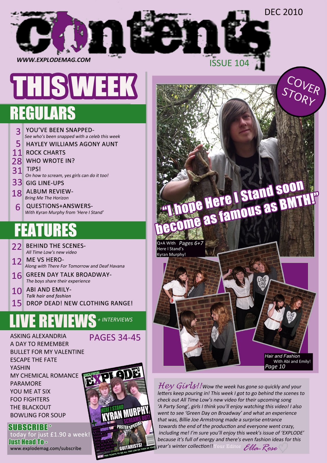
Contents Analysis-I have used a lot of typical conventions on my contents page. For the ‘masthead’ I have used the same font as the front cover had but instead changed the word from ‘explode’ to ‘contents’, this ‘scratchy’ font also connotes ‘rebellion’ and ‘danger’. I also added a purple colour to the letter ‘o’ like I did with the letter ‘x’ in ‘explode’. For the information I have the typical ‘regulars and features’ but also an extra ‘live reviews + interviews’ to make it slightly different. My main image on the contents page is of Kyran because he is on the front cover as the ‘cover story’, I also added a pull quote to make it more interesting for the reader. The extra images I have on the contents are a few of Abi and Emily, as this is a girls magazine added Abi and Emily in to promote and talk about ‘hair and fashion’ which girls would like to read about other than music. I used four similar shots of them to suggest girls taking amateur shots with their mobile phones rather than a specific photoshoot. This adds informality to the page and helps the reader to relate to it more. I also added an ‘editor's letter’ to make the magazine relate to the audience and give it a personal side to it. I also added the front cover on the contents page so people can ‘subscribe’ to my magazine. I stuck to the similar colour scheme which is purple and greens, but also made the background pink for a more girly effect. I used quite chatty language to relate to my audience, it’s not completely ‘slang’ but the chatty language helps my magazine become more personal to the reader. I have rotated a few images to make the magazine look fun and a few of the images overlap other images on the page to make it feel packed and worth reading. On the photos of Abi and Emily I added in a purple colour box behind them so it makes them stand out more.

DPS Analysis-For my double page spread I have used a lot of conventions. I have used a kicker to start off and set the scene of the article, also a drop cap for the word ‘Here’. I also used gutters to separate the columns and the body of the text. I created a pull quote, but not typically in-between the text, I added mine at the top of the page, very large, so when readers flick through the magazine it would draw their attention to the article. I also added in a caption on the photo of ‘Here I Stand’. I used a serif font for the body text, to make it look quite sophisticated and easier to read, but a sans-serif font for the pull quote. I also added in a sidebar that has more information about the band as a whole and what dates their album is released. I decided to add quite a big photo of ‘Kyran’ to the left of the page, so it could possibly be used a some sort of poster for the reader, as a little extra. I didn’t use a lot of images as it might confuse the reader, the photo of Kyran is a subjective shot to relate to the reader. I kept to the colour scheme of white, black, purple and green, I thought this would be easier and it reinforces the overall house style of the magazine.

Aspects of layout conventions- My magazine name ‘EXPLODE’ connotes that it is full of life, that it is big and that it is in-your-your face. My images made it quite hard for the text to be seen on the cover, so I had to use the clone tool to crop out ‘text and images’ on Kyran and Will’s t-shirts. I took the boys to Carlton Marshes for my photoshoot and made them stand in front of a green barrel because it was different to using a stereotypical white background. For the poster special images I took Chris to the Uplands Field and took Reuben to the side of my house where I decided to use a brick background so I could have a variety of different backgrounds. Kyran, Chris, Tom and Will are all roughly about the same age (15-16), they aren’t really showing an expression on my cover which shows they have an attitude, preferably an ‘I don’t care’ attitude, they all also are using a subjective shot to grab the reader's attention. They are dressed fashionably and, with their good looks, are likely to appeal to the target audience of female teenagers. I placed the masthead at the top because it is typically conventional. My contents page has the typical ‘regulars’ and ‘features’ I also added in ‘live reviews+ interviews’ to make it more interesting. The music genre is ‘rock’ you can see it is because of the scratchy masthead, dark colours, also by the boys typical ‘long hair’. This magazine fills a gap as there aren’t really any ‘rock’ magazines for females. There is ‘Kerrang’ and ‘Rock Sound’ but they are mostly for males and it would be good for the female audience to have a ‘rock’ magazine all to themselves.


