Thursday, 20 January 2011
A slideshow showing my progression and development
This is a slideshow i have been producing that helps you follow the progression of my work throughout the course of this project. Sorry for the such low quality of 'print screen' shots.
Wednesday, 19 January 2011
Who would be the audience for your media product?
The target audience for my music magazine is females from the ages of 14-19. I decided to use this as my target audience because I believe there is a gap in the market for my magazine. There are already a few magazine that concentrate on the ‘rock’ genre but in my opinion, and from my research, they are only targeted towards males or both sexes, it would be good to have a single sexed rock music magazine.
A member of my target audience could come under the following categories of ‘uk tribes’
Emo’s:

Scene Kids:
Skaters:
Metalheads:
The people in these tribes would consider themselves different to the ‘norm’. Usually in the media these tribes are seen as being ‘negative’, but my magazine helps them express themselves without being afraid to stand out. They are very opinionated people that are usually considered rebellious.
My audience would usually wear bands t-shirts, but in other ways quite trendy clothes. Their favourite online shop would be ‘Drop Dead’ http://store.iheartdropdead.com/
Their favourite brand of shoes would be converse and they never go anywhere without their iPod full of rock music! The girls would usually have backcombed hair filled with hairspray and would usually wear a lot of eyeliner. The TV shows they would watch could be Family Guy or The Inbetweeners as they are very comical and are usually aimed at teenagers.
Tuesday, 18 January 2011
How did you attract/address your audience?
My magazine speaks in the language of my audience. I have added notes to my images that explain how. Someone would like to buy my magazine because it is full of life and fun. There is a space in the market for it because it is a ‘female’ rock magazine whereas Kerrang, Rock Sound and other ‘rock’ music magazines are either targeted at males or both sexes. It also has ‘girl-like’ aspects to it, for example the Fashion and Hair section. I think most female teenagers would like this magazine as the language used in it is wrote like a sister/best friend to the audience.


Monday, 17 January 2011
Looking back at your preliminary task (the college magazine task), what do you feel you have learnt in the progression from it to full product?


As you can see from my Preliminary Task and my Main Task, I have developed my Photoshop skills a lot during the course of this project. My front covers vary a lot, for my Preliminary Task I didn’t experiment much with using crop tools on the image because it was such a basic photo it didn’t need any work done to it. Whereas for my Main Task it took a lot of work to get the main image perfect, I had to crop out each individual person and ‘clone tool’ their tops because the words on logo’s on them were distracting, I also had to re-add the background in. On my Preliminary Task, I believe I used too many fonts and it looked very messy because I didn’t have a set colour scheme, it doesn’t look very exciting either, it looks quite rushed. Whereas my Main Task has a structured layout, a set colour scheme and its looks exciting with big, bold fonts. I also added other images to my Main Task front cover to show the magazine will be exciting, it also has a lot of cover lines, whereas my Preliminary Task doesn’t have many cover lines and no other images. I also learnt a lot more about using ‘strokes’ to enhance words and objects, my Main Task looks bold and it stands out, whereas my Preliminary Task looks flat and boring. The contents pages look totally different, my Preliminary Task looks basic, I couldn’t even call it a contents page, I have developed so many more skills on making a good contents page. I learnt about ‘Regulars’ and ‘Features’ by researching other contents pages, about adding photo’s so the reader thinks the magazine is worth reading, aligning everything properly to make it look professional and making everything look as exciting as possible for the reader.


Friday, 14 January 2011
How does your media product represent particular social groups?
(Bullet For My Valentine has been shortened to BFMV)

I found this image of a rock style band called ‘Bullet For My Valentine’ and noted that it was similar to my photo of Here I Stand. Each band has four members and they are all positioned in the same kind of way, if you look at the ‘BFMV’ image and the ‘Here I Stand’ image, they are both standing in front or behind each other in the same way. The only difference in the positioning is that their hands are in the pockets on the Here I Stands image whereas in BFMV’s they’re not. Also the expressions on everyone’s faces are more or less the same as each other; they are always using a subjective shot with a plain expression on their faces to show they have an ‘I don’t care’ attitude, which comes across in most ‘rock stars’. What I also thought was clever is that both backgrounds a very similar apart from Here I Stand’s curves round at the edges. The shot types are clearly the same which is a medium long shot. The lighting is slightly different, BFMV’s lighting is quite dark whereas Here I Stand’s is using natural light, BFMV’s is darker because it has been edited that way in post production, probably Photoshop. Also their clothes are quite different, BFMV’s are very dark and gothic like whereas Here I Stands have abit of colour to it, which appeals to a younger, more female audience. I think their hairstyles are also quite similar, Tom from Here I Stand (second to the left) has his hair over his eyes abit, this is the same as the second from left guy in BFMV. Also Kyran from Here I Stand has longish hair, as does Matt from BFMV. Bullet For My Valentine are quite dark and mysterious in this photo, which could show their music and style is quite ‘Goth like’ whereas Here I Stand seem more lighter and more updated for the newer stereotypes that are coming around for example ‘Scene Kids’ and ‘Emos’.
 Teenagers like to belong to sub-cultures and create identities for themselves which are different to the mainstream. My music magazine targets the sub-cultures of ’Scene Kids’, ‘Emo’s’, ‘Skaters’ and ‘Punks’. It both reflects my audience's interests and tastes and is a guide for my readers to follow. My magazine does have a pro-consumerist side to it, as a few of my models are wearing ‘Drop Dead’ t-shirts which usually target my sub-cultures, but it also has an anti-consumerist side that helps you to stand out and to not be afraid to wear what you want and to be your own person. Most teenagers are presented negatively in the media such as the tabloid newspapers, but magazines such as Kerrang help teenagers and their audience be accepted in what they want to do and listen to their audience's needs and show this in their magazine. This is exactly what I have tried to do in Explode.
Wednesday, 12 January 2011
What have you learnt about technologies from the process of constructing this product?
The programs and technology I used to help me produce my magazine were-
Photoshop, Blogger and Flickr.
 I used Photoshop to help me edit and put my magazine together to become what it is now, I had never used Photoshop until AS Media and I believe I have learnt a lot. For example I knew exactly what type of background to use to take my images so it’s easier to crop the person out. I learnt how to add borders in my own way. Also I developed my own techniques and tricks to use without any help as I started to progress and develop my own skills. For example my front cover, on the original photo they weren't that close together, but because of the 'easy to work with' background, it was managable to crop the boys out and re-add them closer together.
Advantages-
· The layout is simple and you can find what you’re looking for because the categories are set out well.
· If something went wrong or didn’t work out well you can undo it at any time using the ‘History’ tool.
· It’s easy to crop people out of photos and add them into other photos with a professional look using the ‘magic wand’ tool and the ‘eraser’.
· A lot of control over text layouts and arrangements.
· Helps you improve your images using the ‘Image’ and ‘Filter’ options.
· Its gives the overall finished project a professional look.
Disadvantages-
· It can be quite difficult to get use to the variety of different options to use. Usually you would need someone who knows Photoshop well to guide you through the basics and then soon you can figure the rest out and find your own tricks.
· The files also take up a lot of memory on your hard drive.

I used Blogger to publish all of my work, even my ‘Flickr’ items. The homepage is very well set out and you can add ‘new posts’ quick and easy.
Advantages-
· It’s free and easy to use.
· You can group sections of your work.
· You can style them to be your own.
· Publish all of your work.
· It saves your work automatically.
Disadvantages-
· Your blog could get deleted by ‘Blogger’/’Google’, so they aren’t really entirely in your control.
I used Flickr only to add tags/notes to analyse images such as magazine covers and contents pages.
Advantages-
· There isn’t a storage limit so you can upload as many photos as you want.
· It’s free.
· Easy to use and manage.
Disadvantages-
· Well personally I only really used it to add tags to my images and didn’t explore the site very much because I preferred blogger.

Tuesday, 11 January 2011
Original Photo's (need to add contents page ones)
 |
| I used this photo of Kyran for my front cover |
 |
| I used this photo of the other three on my front cover. |
 |
| used this on my dps. |
 |
| i used this on my dps |
 |
| this as a poster special on my front cover |
 |
| this on my front cover as a poster special |
 |
| Abi and Emily on my contents page |
 |
| Abi and Emily on my contents page |
 |
| Abi and Emily on my contents page |
 |
| Abi and Emily on my contents page |
 |
| I used Kyran (on the left) on my contents page |
In what ways does your media product use, develop or challenge forms and conventions of real media products?
Conventions are the typical traditions and rules that the audience expects. Some magazines are more conventional than others depending on the audience and the subject matter. The genre of my magazine is ‘rock for females’, some of the magazines that influenced me, and whose conventions I followed, were ‘Kerrang’ and ‘Rock Sound’.


 |
 |

Cover Analysis-For my masthead I decided to make it quite ‘scratchy’ and ‘graffiti like’, to show the magazine is quite rebellious and edgy. I also added in a purple colour for the ‘X’ to make it slightly different from conventional mastheads. My main image is of the band ‘Here I Stand’ and as Kyran is the main focus he is in the middle and is slightly
further forward and larger than the others. The other images I used were for ‘free posters’. I have quite a few cover lines on my front cover, and ‘exclusive’ on the top, a ‘win’ on the bottom and a ‘+’ that has a lot of extras on the left. I decided to price my magazine at £2.00, I believe it is quite reasonable for my target audience's price range. The date is Dec 2010 and it is a monthly magazine. The colour scheme I have used is black, white, green and purple. I decided to use purple because Chris’ top in the image is purple, which made me come to the conclusion of using its opposite colour green to add effect to the cover. The other reason I chose purple was I wanted to appeal to females whilst avoiding a stereotypical pink, purple is feminine and cool. I have used a few shapes on the cover, such as the slanted rectangle around the words ‘Here I Stand’ and ‘Kyran Murphy’, also rectangle shapes for ‘exclusive’ and ‘win’. I also put a border around the posters to make them stand out a bit more. The fonts on my layout are slightly varied but not a lot, they are all bold and are sans-serif. Kyran and Toms heads overlap the title which shows its quite a well known magazine, also the text overlaps the boy's torsos to make it stand out. I think the language I have used relates well to my audience, the title ‘Kyran Murphy Screams Out’ shows will be talking to us and the readers, but he is also the ‘screamo vocalist’ of the band which makes the title easy to relate to.

further forward and larger than the others. The other images I used were for ‘free posters’. I have quite a few cover lines on my front cover, and ‘exclusive’ on the top, a ‘win’ on the bottom and a ‘+’ that has a lot of extras on the left. I decided to price my magazine at £2.00, I believe it is quite reasonable for my target audience's price range. The date is Dec 2010 and it is a monthly magazine. The colour scheme I have used is black, white, green and purple. I decided to use purple because Chris’ top in the image is purple, which made me come to the conclusion of using its opposite colour green to add effect to the cover. The other reason I chose purple was I wanted to appeal to females whilst avoiding a stereotypical pink, purple is feminine and cool. I have used a few shapes on the cover, such as the slanted rectangle around the words ‘Here I Stand’ and ‘Kyran Murphy’, also rectangle shapes for ‘exclusive’ and ‘win’. I also put a border around the posters to make them stand out a bit more. The fonts on my layout are slightly varied but not a lot, they are all bold and are sans-serif. Kyran and Toms heads overlap the title which shows its quite a well known magazine, also the text overlaps the boy's torsos to make it stand out. I think the language I have used relates well to my audience, the title ‘Kyran Murphy Screams Out’ shows will be talking to us and the readers, but he is also the ‘screamo vocalist’ of the band which makes the title easy to relate to.
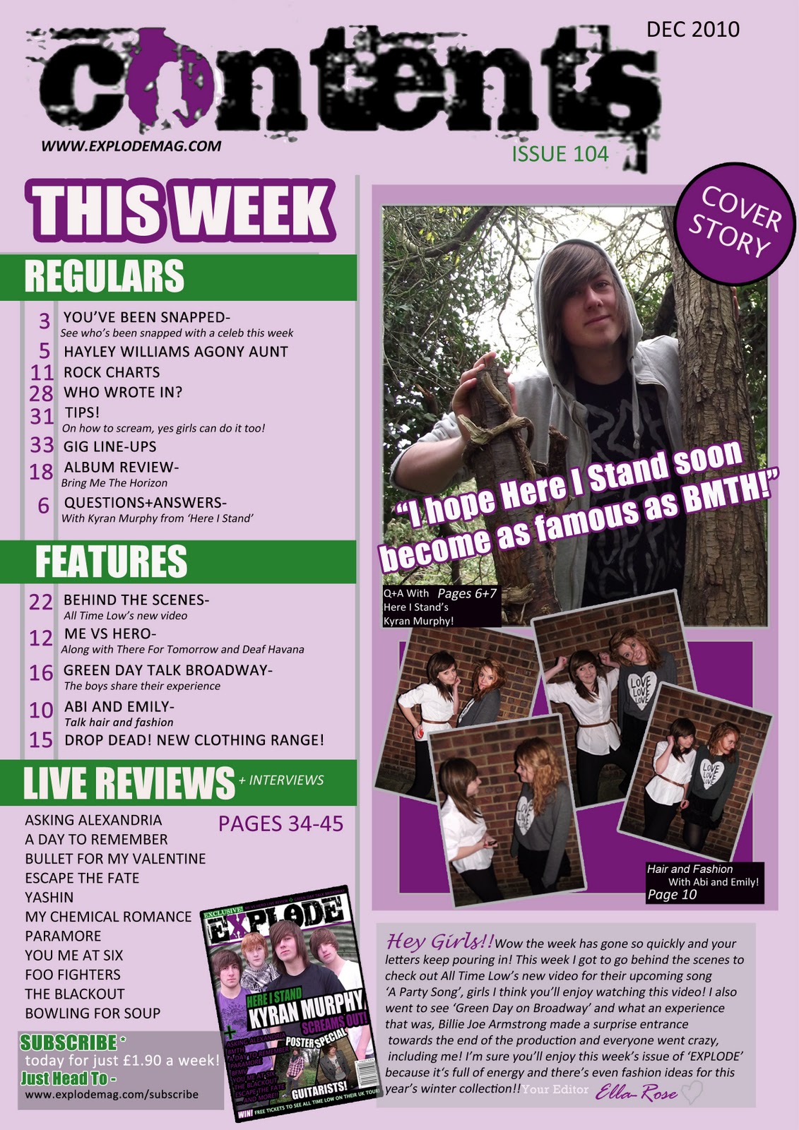
Contents Analysis-I have used a lot of typical conventions on my contents page. For the ‘masthead’ I have used the same font as the front cover had but instead changed the word from ‘explode’ to ‘contents’, this ‘scratchy’ font also connotes ‘rebellion’ and ‘danger’. I also added a purple colour to the letter ‘o’ like I did with the letter ‘x’ in ‘explode’. For the information I have the typical ‘regulars and features’ but also an extra ‘live reviews + interviews’ to make it slightly different. My main image on the contents page is of Kyran because he is on the front cover as the ‘cover story’, I also added a pull quote to make it more interesting for the reader. The extra images I have on the contents are a few of Abi and Emily, as this is a girls magazine added Abi and Emily in to promote and talk about ‘hair and fashion’ which girls would like to read about other than music. I used four similar shots of them to suggest girls taking amateur shots with their mobile phones rather than a specific photoshoot. This adds informality to the page and helps the reader to relate to it more. I also added an ‘editor's letter’ to make the magazine relate to the audience and give it a personal side to it. I also added the front cover on the contents page so people can ‘subscribe’ to my magazine. I stuck to the similar colour scheme which is purple and greens, but also made the background pink for a more girly effect. I used quite chatty language to relate to my audience, it’s not completely ‘slang’ but the chatty language helps my magazine become more personal to the reader. I have rotated a few images to make the magazine look fun and a few of the images overlap other images on the page to make it feel packed and worth reading. On the photos of Abi and Emily I added in a purple colour box behind them so it makes them stand out more.

DPS Analysis-For my double page spread I have used a lot of conventions. I have used a kicker to start off and set the scene of the article, also a drop cap for the word ‘Here’. I also used gutters to separate the columns and the body of the text. I created a pull quote, but not typically in-between the text, I added mine at the top of the page, very large, so when readers flick through the magazine it would draw their attention to the article. I also added in a caption on the photo of ‘Here I Stand’. I used a serif font for the body text, to make it look quite sophisticated and easier to read, but a sans-serif font for the pull quote. I also added in a sidebar that has more information about the band as a whole and what dates their album is released. I decided to add quite a big photo of ‘Kyran’ to the left of the page, so it could possibly be used a some sort of poster for the reader, as a little extra. I didn’t use a lot of images as it might confuse the reader, the photo of Kyran is a subjective shot to relate to the reader. I kept to the colour scheme of white, black, purple and green, I thought this would be easier and it reinforces the overall house style of the magazine.

Aspects of layout conventions- My magazine name ‘EXPLODE’ connotes that it is full of life, that it is big and that it is in-your-your face. My images made it quite hard for the text to be seen on the cover, so I had to use the clone tool to crop out ‘text and images’ on Kyran and Will’s t-shirts. I took the boys to Carlton Marshes for my photoshoot and made them stand in front of a green barrel because it was different to using a stereotypical white background. For the poster special images I took Chris to the Uplands Field and took Reuben to the side of my house where I decided to use a brick background so I could have a variety of different backgrounds. Kyran, Chris, Tom and Will are all roughly about the same age (15-16), they aren’t really showing an expression on my cover which shows they have an attitude, preferably an ‘I don’t care’ attitude, they all also are using a subjective shot to grab the reader's attention. They are dressed fashionably and, with their good looks, are likely to appeal to the target audience of female teenagers. I placed the masthead at the top because it is typically conventional. My contents page has the typical ‘regulars’ and ‘features’ I also added in ‘live reviews+ interviews’ to make it more interesting. The music genre is ‘rock’ you can see it is because of the scratchy masthead, dark colours, also by the boys typical ‘long hair’. This magazine fills a gap as there aren’t really any ‘rock’ magazines for females. There is ‘Kerrang’ and ‘Rock Sound’ but they are mostly for males and it would be good for the female audience to have a ‘rock’ magazine all to themselves.
Monday, 10 January 2011
What kind of media institution might distribute your media product and why?

I have also considered the disadvantages of going with a large publisher. ‘Bauer’ are likely to want to take control over my magazine and change it to what suits them, which I wouldn’t really like, as this is my own work and they might affect my editorial independence.
I have also considered maybe going with IPC, Bauer’s biggest UK rival. Even though Bauer do a male Kerrang magazine, I could possibly go against the ‘male’ rock magazine and see if my female magazine makes more profit and becomes more popular. Like Bauer, IPC don't currently have a rock magazines for female teenagers.
I have also considered ‘self-publishing’ where I do all the work myself. This would help my editorial independence, but it might not get as popular as other magazines that are about and I might not get as much profit as I’d hope for. Distribution is difficult and costly and it would be much harder for an independent to get onto the shelves of W.H.Smith. However, I would use technology as much as possible to promote my magazine online which is cheaper and more direct and suits the interests of my audience.

But by going with Bauer and looking at their ‘tables’ I would still have an online website and maybe a television show to go with my magazine. Such uses of synergy are linked to success and profit and their is already a model as Kerrang is a magazine, a TV show and a radio station. Also my magazine could get advertised/featured in other music magazines Bauer produced. This is known as cross-advertising.
Thursday, 6 January 2011
6th Jan .. 2.30pm .. DPS

Monday, 13 December 2010
My Finished Drafts Of My DPS+Cover 13th Dec

These are my final DPS and cover so far, i havent completed my contents page yet as i need to add more photos.

Thursday, 9 December 2010
Front Cover, Contents + DPS So Far 9th Dec 2010


Friday, 3 December 2010
2/12/10

Thursday, 18 November 2010
Double Page Spread Analysis
 |
| This double page spread is from Kerrang magazine. It has a simple white background that makes the text stand out. There is four columns of alot of writing and five images surrounding the left hand side which all have small captions on them. They also have a slightly grey/white border to make them individual images and so they stand out. Dave Grohl (man in the images) is holding an award which shows he is a vey successful man, next to this image is a pull quote which shows it is said by him. |
 |
| This double page spread has a black background and white and red writing, by using three simple colours it doesn't over crowd the or complicate the spread. A pull quote is used as the masthead so it draws the reader in, it also uses strachty font which symbolises rebellion.. They have used one main image which blends into th background and three smaller images that have captions on them. This particular double page spread has an equal balance of images and text. It also has a separate side bar which stands out to show its also worth reading. |


Monday, 15 November 2010


Friday, 12 November 2010
Fonts For Masthead

i chose these specific fonts because they would suit my kind of magazine, there bold and quite scratchy with shows they look quite rebelious, personally for my masthead font i think the best font to use is either 'capture it' or 'scratch punk'
|
| Some ideas from fonts sourced at http://www.dafont.com/ |
Thursday, 11 November 2010
Music Magazine Ideas adn Audience Research


I've been planning my magazine ideas for a while now, but considering all this i haven't actually figured out a name for my magazine yet.
I think mostly punks and goths,
skaters http://www.uktribes.com/?p=tribe&id=11
emos http://www.uktribes.com/?p=tribe&id=9
 The content in my magazine would be similar to ones already out there, like Kerrang and Rock Sound, except it would have more feminine content like make up and fashion and hair ideas. I will include things like band interviews, album and song reviews, gig reviews and posters etc. It will also include a variety of rock music from pop-punk to screamo to heavy metal, to attract a wider audience.
The demographic i looked into first for my magazine was gender, my audience is going to be mostly aimed at females, even though there are many 'rock' magazines out for both genders i felt that there could be one just aimed at mostly females as it would be a good idea, so i could add in separate things other than music like make up and girly related topics. My age group is between 14-19 year olds, i chose this age because they are probably most interested in the latest band gossip, also because my magazine is a typical 'rock' magazine at this age most teenagers want to become their own person and some would consider themselves in a 'tribe', which comes to my idea of the psychographic of my magazine.
I think mostly punks and goths,
skaters http://www.uktribes.com/?p=tribe&id=11
emos http://www.uktribes.com/?p=tribe&id=9
and scene kids http://www.uktribes.com/?p=tribe&id=10,
but also the typical girly girl ...
... that likes rock music would be interested in reading and buying my magazine, you don't really need to be in a tribe just to buy this magazine in my opinion. My magazine will be based in England, so then people can see where abouts in England certain gigs are, the bands i include in my magazine wont just be from England though but some from other countries like America for example.
I have decided to have a catchphrase for my magazine which would help promote my magazine because its similar to kerrang.. it will be like ' kerrangs sisters' but as you can see i need to perfect the catchphrase. Kerrangs price is about £2.20, and i will price my magazine at £2.00 as it is new on the market and i would want people to buy it. As its new on the market and cheaper than Kerrang i hope alot of people will buy it and i get a profit on it.
 The content in my magazine would be similar to ones already out there, like Kerrang and Rock Sound, except it would have more feminine content like make up and fashion and hair ideas. I will include things like band interviews, album and song reviews, gig reviews and posters etc. It will also include a variety of rock music from pop-punk to screamo to heavy metal, to attract a wider audience.
 My magazine will be like the style of Kerrang but more feminine so it will have brighter colours like pinks and purples, it will have famous bands/artists on the front but also unknown ones mentioned as a cover line so people will be interested to see the review on them. My magazines unique selling point will be that its target audience is females, as most other magazine are usually aimed at males.
Subscribe to:
Posts (Atom)